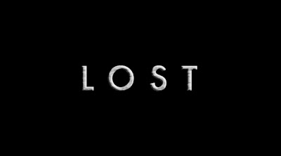
most shows have one logo/typeface that is used ubiquitously to brand the show. 'lost' however has several different treatments for its title, which is unusual, and considered by many designers to be sloppy. the multiple typefaces are surprising, especially since the show is produced by disney, which manages all graphic aspects of its properties very tightly. i'd love to learn about the reasoning behind the show's font decisions. another reason i find the multiple fonts surprising is 'lost's' heavy influence from 'the prisoner,' which made impeccable use of its one distinguishing typeface, albertus.
i suppose the argument for the multiple typefaces is that, really, it's the title itself that is 'the brand.' i'm impressed by the number of people on various social networking sites who, in their list of favorite tv shows, reference the show in all caps, ie: LOST. some people will even put an additional space between each letter so that it better resembles the final title: L O S T.
let's look at the different uses of typography on the show.![]()
first there is the opening floating logo, which starts out of focus in the distance, comes into focus for a split second, and then passes the camera, disappearing forever. the opening title is a metaphor for the entire show of course - it tells you in about 5 seconds everything you need to know: this is a show about mystery that will only seem clear for a split second before moving onto the next unanswerable question. the font is futura, which matches the opening credits, as well as the menus on the excellently designed dvd menus. it's almost worth shelling out for the dvd's just to see all the menus.
the opening title is often criticized for being shoddily rendered - you can see the polygon seams flicker during the moment that the letterforms are in focus. the offending area has been selected in the photo above. this is also the precise moment on the soundtrack when weird electronic 'sparkle' sounds can be heard. i don't think it's deliberate, but that bad graphics rendering is all i can ever look at as those letters fly by.
i love futura. so does wes anderson, who has pretty much adopted the font as his calling card. it has an elegant simplicity that is unimposing, and yet not completely characterless (the way, say, helvetica is characterless - and yes i've seen 'helvetica' and i still hate the font).
now, the 'boom' title.
this title is inexplicably typeset in verdana, with a photoshop roughen and emboss filter applied to it. why the font change? why not keep the typeface consistent? verdana!?? if helvetica has no character, then verdana is the awkward guest at the party who only wishes they were as cool as helvetica. verdana doesn't even count as a real font, if you ask me. it was commissioned by microsoft to be legible in highly pixellated situations. it's such a strange choice. as an experiment, i recreated the final 'boom' title in futura, to match the opening:
not a perfect rendering. it's difficult to find the correct amount of 'roughen' without distorting the letterforms, but you get the idea. i think it works, and it would unify the show's look.
the two title treatments are thematically very different. the opening poses a question, builds mystery and is about uncertainty. the closing is a definitive stamp that says 'this is the show.' it's the answer to the opening - so maybe it makes sense that the 'answer' looks different than the question. as an answer, it's also roughed up - it's been through shit, it's been through all the shit you just watched in that episode. again, it's similar to how 'the prisoner' ended every episode with the prisoner's face rushing toward the screen, then the 'slam!' of prison bars in front of him.
the third treatment of the title is the one that appears in promotional printed and web media outside of the show itself. it's used in the posters, on the dvd cases, action figure boxes, and on all other official materials:
i thought perhaps this font was something unique like attriumvirate-inserat, but no, it's simply impact (the short leg of the 'L' gives it away), with a rough texture applied to it. millions of highly specific fonts at their disposal, (we're talking about disney here!) and they chose from the drop-down list in microsoft word. impressively though, the 'lost' design team has been very consistent with their use of this title treatment. the texture and its placement has remained exactly the same since season 1.
i can understand the need for a title treatment like this, since futura doesn't quite convey the scale and scope of the show. even a futura bold, or futura heavy with this same texture applied doesn't quite look right. it looks more like 'the darjeeling limited' than 'lost.' here's futura given the same texture/treatment as the print version:
hmm. i think it could have worked..
i do like the posters and dvd cases adorned with the impact font logo, and i enjoy the way the dvd box sets look next to each other on the shelf. i'd love to design a set of dvd boxes one day - that first season box is crucial to setting the standards that must be followed by subsequent boxes. then the season two box establishes the variables with which each subsequent season will define itself - usually with color palette. the season 4 dvd box has an especially clever touch - here is the outside:
when you slide the case out of the translucent plastic cover, the '4' is replaced by a subtle '6' in the water, and the images of the oceanic 6 are highlighted, brought to the foreground, and even embossed on the box - and baby aaron has moved from claire's arms into kate's. very subtle, and classy.